Figma UI kit
Jeevy OS · Ferrum design system

Design principles

Explore the core human commitments and physical realities that guide software for industrial fabrication.

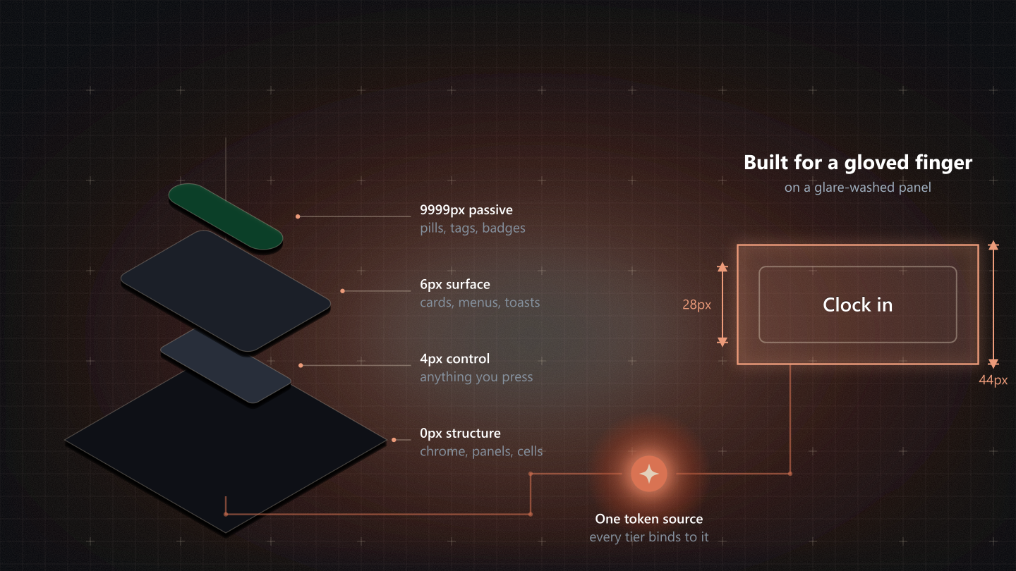
An exploded view of the four shape tiers, 0px structure, 4px control, 6px surface and 9999px passive, wired to one token source, beside a 28px Clock in button inside its 44px glove boundary.

The four principles

1. Respect the physical environment

Built for the gloved finger

The care behind it

Your users are working in glare-washed environments, with dirty hands, thick gloves, or while multitasking under physical stress.

The principle

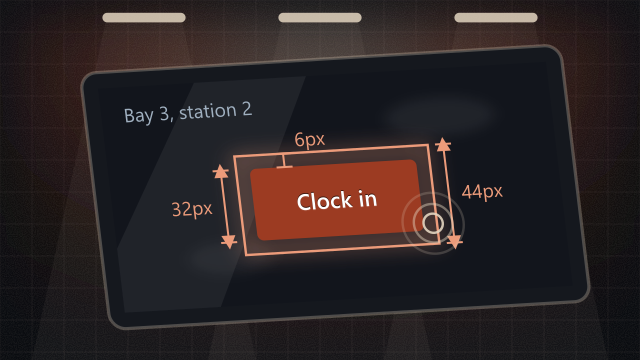
Software must adapt to the physical shop, not force the shop to adapt to a screen. We design with oversized tap targets (minimum 44px to 48px), stark visual hierarchies that cut through industrial glare, and highly tactile interaction cues. If a welder cannot execute an action flawlessly with a single, gloved thumb on a smudge-covered tablet, the design has failed them.

How it applies to our components
  • Oversized hitboxes on your Buttons and Toggle elements (invisible 44x44px ::after hit boundary).
  • High-contrast states on your Data grids and ledgers; monotonic lightness ladder that prevents washed-out gray-on-gray styling.
2. Honor familiar mental models

Bridges over barriers

The care behind it

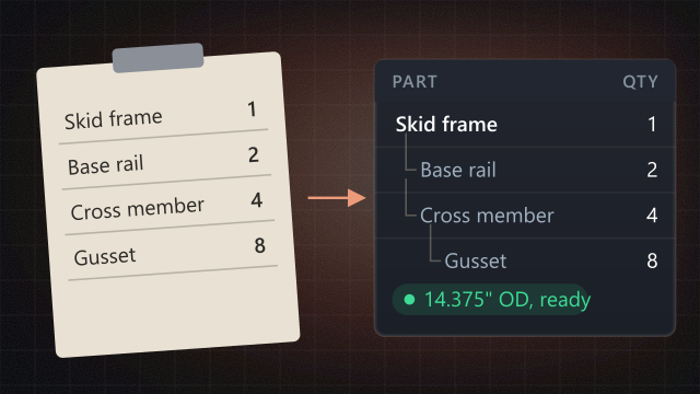
External fab owners and PMs rely heavily on tools they already trust, like paper clipboards, Excel sheets, and physical whiteboards. Forcing a highly abstract, tech-heavy “SaaS layout” causes tech anxiety.

The principle

Meet users where their experience already lives. We lean into existing industrial and spreadsheet conventions rather than forcing them to learn an entirely new software vocabulary. Data grids should mimic the predictability of a well-structured ledger; structural relationships should read clearly like a physical Bill of Materials (BOM). Familiarity breeds confidence, and confidence breeds speed.

How it applies to our components
  • Keeping tabular data straightforward in Tree view (BOM) and data grids.
  • Optimizing standard Text inputs, date pickers, and steppers to behave like physical ledger lines.

3. Radically reduce cognitive load

Clear, never clever

The care behind it

A welder or PM shouldn’t have to think about where their data went or if they clicked the right button. They are thinking about tolerances, safety, and deadlines.

The principle

Information must be scannable in one glance from three feet away. We completely eliminate visual clutter and hidden states. Every status indicator must explicitly state its meaning, and system changes must provide immediate, unmistakable feedback. We prioritize progressive disclosure so users are never flooded with numbers they don’t need right now, reducing operational mistakes.

How it applies to our components
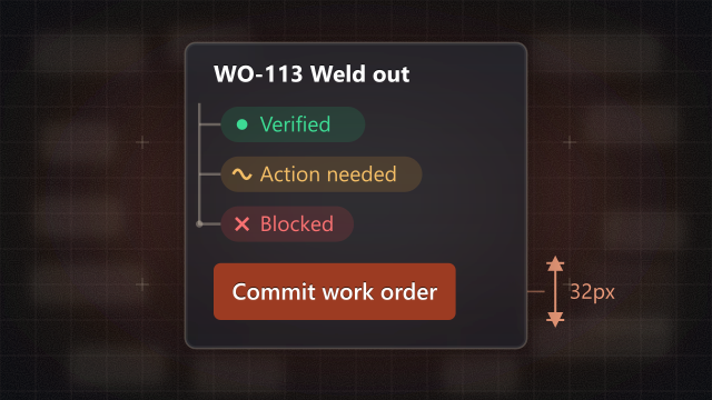
  • Clear formatting rules under your Typography and data formats (one primary commit action per viewport).
  • Distinct Status logic: green means verified, amber means action required, red means blocked.
  • Clean Pills and tags with explicit, non-misleading AI provenance chips.

4. Design for ultimate reassurance

Forgiving by default

The care behind it

Users with lower tech literacy live in constant fear of “breaking the system” or permanently deleting hours of work with an accidental click.

The principle

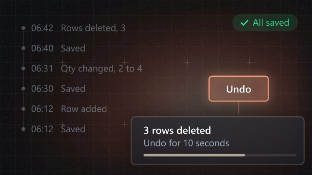
A user’s mistake is a system flaw, not a human failure. We treat every destructive action as recoverable. We build deep safety nets into our workflows, prioritizing forgiving “Undo” mechanics over annoying, repetitive confirmation modals. The software should feel like a steady, indestructible tool that protects the user’s data, building absolute trust with external shop owners.

How it applies to our components
  • Pre-merge compliance gates that prevent invalid destructive buttons.
  • Bulk action bar safeguards and non-destructive operations.
  • Clear Toast and notifications with persistent recovery affordances.

Do and avoid

Each principle as a side-by-side comparison: what keeps the commitment, and what breaks it.

Respect the physical environment

Do
Receive
Do: give a dense 28px row action its 44px boundary, so a glove lands on it.
Avoid
Receive
Avoid: an unpadded micro-target. It looks tidy on a monitor and is a miss every time on a terminal.

Honor familiar mental models

Do
Skid frame1
Base rail, W8x312
Cross member, C6x8.24
Do: lay the bill of materials out like the ledger it replaces: one part per line, children indented under the assembly.
Avoid
Avoid: a row of unlabelled abstract icons. Nobody on the floor has a word for them, so nobody presses them.

Radically reduce cognitive load

Do
WO-113 Weld outStart task
Do: one task, one clear next action, at a size you can hit.
Avoid
WO-113 WeEditCopyMoveTagShareLog
Avoid: a utility bar of colliding actions. The name gets clipped and the one thing to do next is lost among six.

Design for ultimate reassurance

Do
3 rows deletedUndo
Do: act at once and offer Undo in the toast. The work is one tap from coming back.
Avoid
Delete 3 rows? This cannot be undone.
CancelDelete
Avoid: a confirmation modal on every delete. People learn to click through it, and the one time it matters, the work is gone for good.

More in Foundations and concepts