Buttons
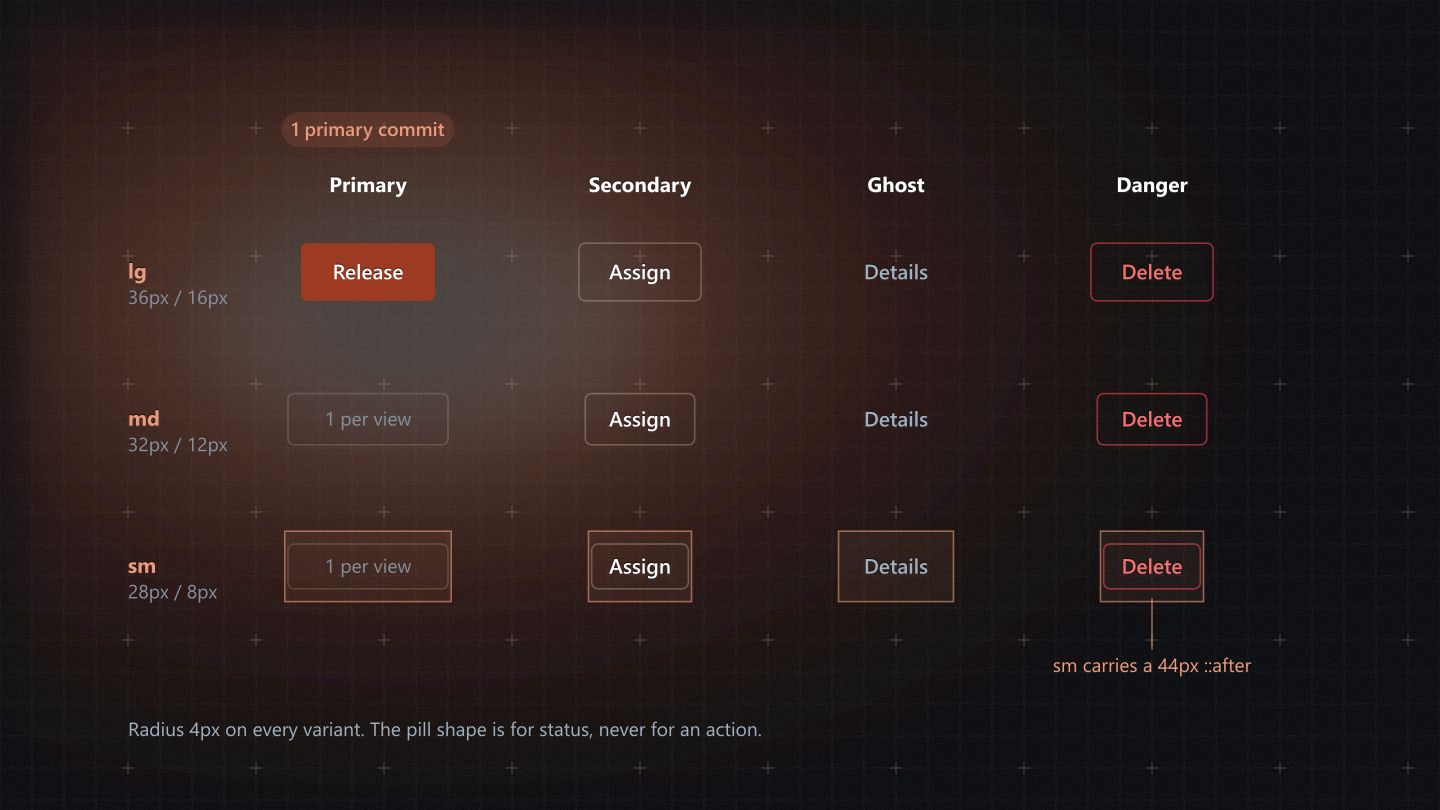
Trigger an action. Four variants chosen by what the action does, three heights chosen by where the button sits. A split button is the compound kind: one commit plus a menu of alternatives.
Quick usage
Import the shared component; never copy its markup into a feature. The Web TSX tab beside the live stage has a complete, working example.
import Button from '@/shared/components/Button';
import SplitButton from '@/shared/components/SplitButton';
Live stage and code
The live component and its controls on the left, the code on the right; change a control and the code follows: Web TSX (the component in a working example), Tailwind and HTML (the markup it renders, with its data attributes), React Native, SwiftUI and Jetpack Compose. The header theme switch drives every stage.
Props
Read from the component's source when the docs build: names and defaults from its signature, types and descriptions from its JSDoc. A blank type means the prop has no JSDoc yet.
Button
| Prop | Type | Default | Description |
|---|---|---|---|
variant | 'primary'|'secondary'|'ghost'|'link'|'link-accent'|'danger' | 'secondary' | - |
size | 'sm'|'md'|'lg' | 'md' | - |
icon | React.ReactNode | null | Leading glyph - `layout=text-icon-leading`. Sized by the caller, because Phosphor takes its size as a prop and a wrapper that overrode it would fight every caller that had already picked one. |
trailingIcon | React.ReactNode | null | `layout=text-icon-trailing` (a caret, say). |
iconOnly | boolean | false | Square box, no label padding. `aria-label` is then REQUIRED - an icon-only control with no accessible name is a button that screen readers announce as nothing at all. |
fullWidth | boolean | false | - |
type | - | 'button' | - |
className | - | - | - |
children | - | - | - |
...rest | - | - | Any other prop is passed through to the root element. |
Source: frontend/src/shared/components/Button/Button.js
SplitButton
| Prop | Type | Default | Description |
|---|---|---|---|
children | React.ReactNode | - | The default action's label. |
onClick | () => void | - | The default action. |
items | - | [] | - |
variant | 'primary'|'secondary' | 'primary' | - |
size | 'sm'|'md'|'lg' | 'lg' | - |
icon | React.ReactNode | null | Leading glyph on the action segment. |
menuLabel | string | 'More options' | Accessible name for the caret segment. |
secondaryAction | - | null | - |
disabled | - | false | - |
className | - | - | - |
...rest | - | - | Any other prop is passed through to the root element. |
Source: frontend/src/shared/components/SplitButton/SplitButton.js
DOM contract
What the rendered element carries: the data attributes its styles key on, its roles and ARIA, its focus style, and whether its stylesheet draws the 44px hit boundary. Also read from the source.
Button
| Data attributes | data-full-widthdata-icon-onlydata-sizedata-style |
| Roles | Native element semantics only |
| ARIA | None set by the component |
| Focus | Styles :focus-visible in its own stylesheet |
| 44px hit boundary | Yes: a ::after in Button.module.css |
SplitButton
| Data attributes | data-dsdata-indexdata-sizedata-variant |
| Roles | role="menu"role="menuitem"role="separator" |
| ARIA | aria-controlsaria-expandedaria-haspopuparia-label |
| Focus | Styles :focus-visible in its own stylesheet |
| 44px hit boundary | Yes: a ::after in SplitButton.module.css |
Accessibility and touch
The contract: 28px (sm) and 32px (md) buttons carry an invisible 44 by 44 touch target. Today Button.module.css does not draw it (see the DOM contract below), so a dense row of sm buttons is under the glove floor until it does.
Visible height 28px. The ::after boundary adds 8px above and below, so a gloved finger lands on a 44px target while the row keeps its density.
Do and avoid
Rules and constraints
Use it for
- Primary for the single commit of a view: Save, Raise PO, Create quote.
- Secondary for every other action; Ghost for low-weight utilities in dense rows.
- Danger for an action that destroys data, in any of the three shapes.
- Split (SplitButton) when one action has close alternatives, such as Export with PDF and CSV. Primary or Secondary only.
Avoid
- Never a second Primary in the same view: the terracotta fill is spent once.
- Never a status colour (green, amber, blue) on an ordinary action.
- Never a pill radius: a rounded button reads as a passive status chip.
Constraints
- Heights 28 / 32 / 36px only (sm / md / lg). An off-tier height fails gate C1.
- Labels in sentence case, 13px, no em dashes.
- Page header actions are md or lg; sm is for table rows.
- Split: takes the same variants and heights as Button; the menu is a portalled surface.