Figma UI kit
Foundations

Data visualization and charts

How Jeevy draws a number so an estimator or shop lead can trust it in one glance.

v1.2.1
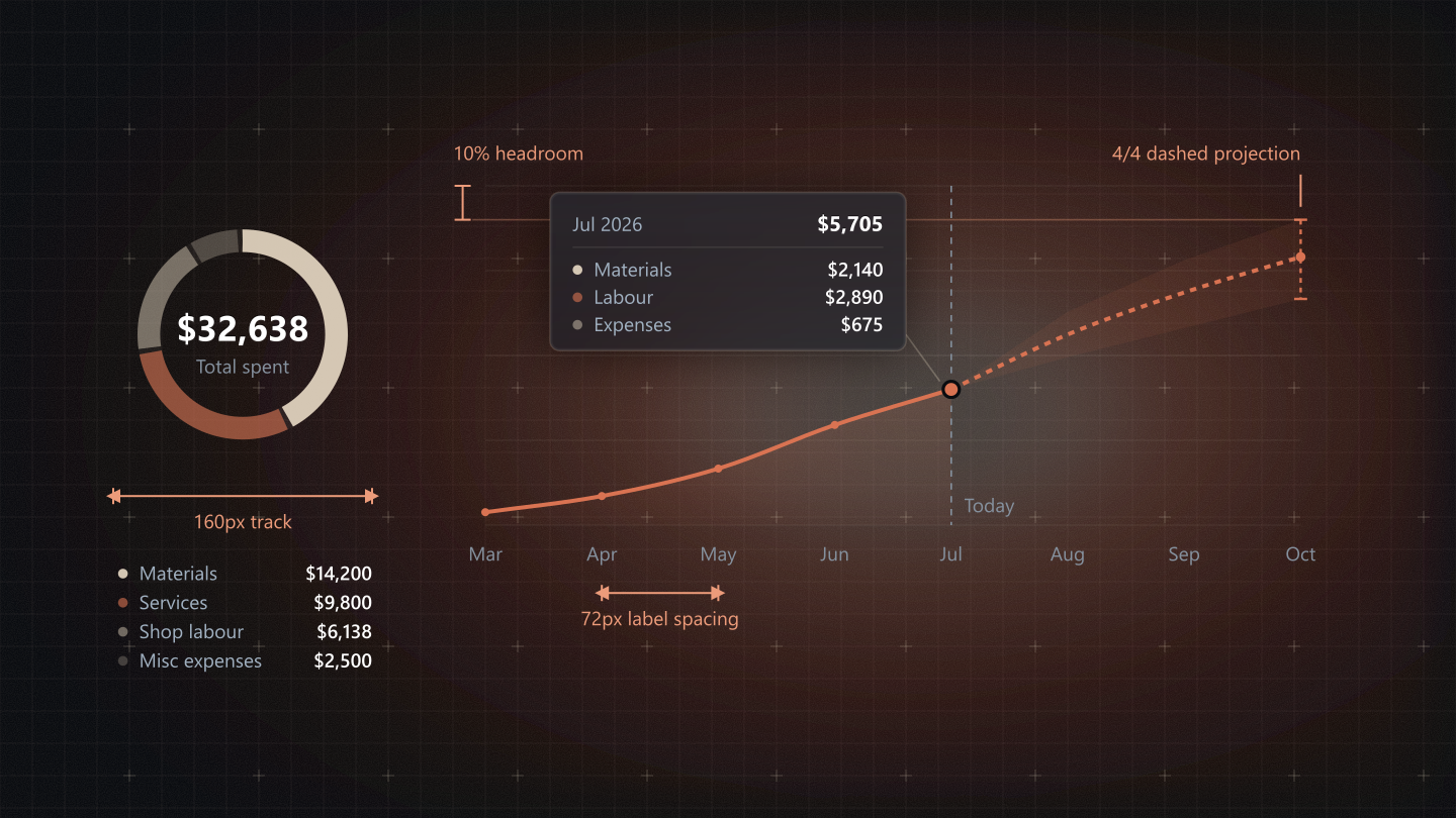
Anatomy of a Jeevy chart: a category ring totalling $32,638 on a 160px track, and a spend line drawn solid to today then dashed 4/4 inside a confidence band, with 10% headroom, 72px label spacing and a Jul 2026 hover card reading $5,705.

Chart catalog

Every chart once. The chart on the left at true size, its code and props on the right, and under them when to use it, when not to, and how it behaves on desktop and on a phone. The shipped Financials charts are embedded live from the portal.

Financial and spend

Spend line and forecast

What the job has cost by the end of each period, against the target budget, with the forecast to delivery.

PropsSpendVelocityChart
PropTypeDefault
timelineThe spend series by period, and the flat target budget rule.{ granularity, points, targetBudget, forecast, laborIncluded, projectionDrawn }required
contractValueThe contract, for the share of contract in the hover card.number | nullnull
projectionMin, projected and max to delivery. Draws the dashed line and its band.object | nullnull
projectIdThe job the card belongs to.string | nullnull
Tokens--link--sand--text-muted--border-subtle
When to use
When users need to track cumulative expenditure against a contract budget and project forward-looking margin risks before delivery.
When to avoid
Avoid using this to audit granular line-item receipts or individual supplier invoices; use the Financials Ledger table for transactional audits.
Desktop
Renders the full Fritsch-Carlson monotone spline with confidence envelopes and anchored cost breakdown cards.
Mobile
Decimates X-axis milestones to Start, Today, and Delivery dates, clamping touch hovers to the nearest week bucket.
Production anatomy
Plot200px tall, padding 16 / 12 / 24 / 48. Five y stops on a nice ceiling (1, 1.25, 1.5, 2, 2.5, 3, 4, 5, 6, 8, 10 x a power of ten), plus 10% headroom.
Line--link, 2px, round caps, a monotone cubic (Fritsch-Carlson) so a running total never dips before a jump.
WashA vertical gradient of --link, 16% at the top to 4% at the base, under the line.
Edge fadeA mask fades line and wash in over the first 6% of the plot and out over the last 6%.
ForecastDashed 4/4 from the last measured point, inside an 8% band, ending on a whisker: a dashed stem, 4px caps and a 3px pip.
BudgetA flat 1px muted rule, dashed 4/4, named in the key, never labelled on the plot.
Hover card240px, pinned to the node not the cursor, flipping below a high point. Period and value, then Materials, Labour and Expenses with 6px dots, then the share of contract.
Financial and spend

Category ring

The whole cost in four fixed categories: what it went on, rather than when.

PropsSpendCategoryDonut
PropTypeDefault
totalsThe four figures for the chosen window. Without it the ring reads the whole job.{ materials, services, labor, expenses } | nullnull
centreLabelWhat the figure in the middle counts.string'Total spend'
captionThe window, when it is not the whole job.string | nullnull
timelineThe fallback source when totals is absent.object-
Tokens--sand--link--text-primary--text-muted
When to use
When users need an instant, high-level breakdown of cost distribution across primary spending categories (materials, labour, services, expenses).
When to avoid
Avoid using this when displaying data across more than six categories or tracking changes over time, as small slices become difficult to compare.
Desktop
Renders a 160px butt-capped arc track with tabular currency totals pinned in the center aperture and an aligned key-value legend.
Mobile
Stacks category legend rows beneath the ring, ensuring every row meets the 44px touch target boundary.
Production anatomy
TonesMaterials sand 92%, Services --link 60%, Shop labour sand 45%, Misc expenses sand 24%.
Ring160px; radius 58, stroke 14; a sand 6% track; butt-capped arcs from twelve o’clock with 3px gaps.
CentreThe total at 20px bold tabular; the period label under it at 12px, muted, natural case.
HoverThe arc thickens from 14 to 16px rather than moving; ring and legend share one active row.
Financial and spend

Composition bar

Committed procurement split by purchase order, as one 10px bar under the total.

PropsCompositionChart
PropTypeDefault
allRowsThe full ranking. It fixes each group’s tone, so a search never recolours one.Array<{ key, primary, secondary, committed }>required
rowsWhat the card is showing, after search.Arrayrequired
captionWhat the total is, for example on 6 purchase orders.string-
formThe split bar, or the same data as a ring.'bar' | 'donut''bar'
onOpenOpens a group, as its table row does.(key) => void-
Tokens--sand--link--text-primary--text-muted
When to use
When procurement needs to see where committed spend went across every purchase order, and no order may disappear into an Other bucket. Every group with money on it keeps its own slice and its own legend row, ranked largest first.
When to avoid
Avoid it when two similar parts must be compared exactly: neighbouring segments of nearly the same width look identical. Read those from the legend, or use vendor bars, which give every amount its own line.
Desktop
Lead with the total in large tabular figures, then the 10px bar, then a legend of every group. Hovering a segment lights its legend row, so the eye can travel from the shape to the number.
Mobile
Keep the bar full width and let the legend scroll past eight rows. Each row carries a 44px touch boundary, so a superintendent opens a purchase order on a tablet without zooming.
Production anatomy
HeroThe total at 24px bold tabular, then a 12px muted caption: on 6 purchase orders.
Stack bar10px tall, rounded only on its two outer ends, segments parted by 2px of card, each at least 4px.
Legend28px rows on a four-column grid: a 6px dot, the name, the share (44px) and the amount (80px). Under 1% reads <1%, never 0%. Unpriced groups sit at the foot with a neutral dot.
Ring formThe same data as the 160px ring, with the same legend beside it.
Financial and spend

Vendor commitments

Purchase order dollars ranked by vendor.

Size
Theme

Vendor commitments

Gulf Coast Steel$184K
Lone Star Pipe$122K
Brazos Fittings$64K
Permian Supply$42K
Bolt Depot$9K
Vendor commitments data
ItemValue
Gulf Coast Steel$184K
Lone Star Pipe$122K
Brazos Fittings$64K
Permian Supply$42K
Bolt Depot$9K
import { sliceTone } from '@/shared/components/DataViz';

const HEIGHT = 200;
const PAD = { top: 16, right: 12, bottom: 24, left: 48 };
const money = (v) => `$${Math.round(v).toLocaleString('en-US')}`;

// Purchase order dollars ranked by vendor.
export function VendorBars({ width, rows }) {
  const max = Math.max(...rows.map((r) => r.value));
  return (
    <div role="list" aria-label="Vendor commitments" style={{ display: 'flex', flexDirection: 'column', gap: 8, width }}>
      {rows.map((r, i) => (
        <div key={r.key} role="listitem" style={{ display: 'grid', gridTemplateColumns: '120px 1fr 72px', alignItems: 'center', gap: 12, fontSize: 12 }}>
          <span style={{ color: 'var(--text-secondary)', overflow: 'hidden', textOverflow: 'ellipsis', whiteSpace: 'nowrap' }}>{r.label}</span>
          {/* A 10px track with pill ends, filled in the ranked tone. */}
          <span style={{ height: 10, borderRadius: 'var(--radius-full)', background: 'var(--neutral-soft-16)', overflow: 'hidden' }}>
            <span style={{ display: 'block', height: '100%', width: `${(r.value / max) * 100}%`, background: sliceTone(i, rows.length) }} />
          </span>
          <span style={{ color: 'var(--text-primary)', textAlign: 'right', fontVariantNumeric: 'tabular-nums' }}>{money(r.value)}</span>
        </div>
      ))}
    </div>
  );
}

// In a card, as on a job (import { ChartCardShell } from '@/shared/components/DataViz'):
//   <ChartCardShell title="Vendor commitments"><VendorBars width={w} rows={rows} /></ChartCardShell>
PropsVendorBars
PropTypeDefault
widthMeasured from the card; the chart never sets its own width.numberrequired
rowsRanked, largest first.Array<{ key: string, label: string, value: number }>required
Tokens--sand--link--text-primary
When to use
When a buyer is deciding who to call first: which vendors hold the most open money on this job. Long vendor names stay readable because each one has its own row instead of being squeezed under a column.
When to avoid
Avoid it for part-to-whole questions, because bars side by side do not show that the parts add up to a total; the composition bar does. Past about a dozen vendors, a sortable table serves better.
Desktop
Name, track and figure sit on one row. The track is a 10px pill in the ranked tone and the figure is right-aligned in tabular numerals, so the amounts line up down the column.
Mobile
Names truncate with an ellipsis; figures never do. The full name lives in the row's accessible label and in the vendor detail one tap away.
Financial and spend

Cumulative area

Running cost to date over the schedule.

Size
Theme

Cumulative area

Cost to date
Cumulative area data
PeriodCost to date
Jan 2026$120
Jan 2026$387
Jan 2026$788
Jan 2026$2,915
Feb 2026$3,087
Feb 2026$3,328
Feb 2026$3,569
Feb 2026$3,775
Mar 2026$4,391
Mar 2026$5,374
Mar 2026$5,760
Mar 2026$6,215
Mar 2026$8,729
Apr 2026$9,017
Apr 2026$9,633
Apr 2026$10,136
Apr 2026$11,265
May 2026$11,405
May 2026$11,607
May 2026$11,875
May 2026$12,105
Jun 2026$14,119
Jun 2026$14,385
Jun 2026$14,927
Jun 2026$15,100
Jun 2026$15,354
Jul 2026$15,527
Jul 2026$15,672
Jul 2026$15,839
Jul 2026$16,028
Aug 2026$18,413
Aug 2026$19,052
Aug 2026$19,769
Aug 2026$20,059
Aug 2026$41,462
Sep 2026$42,013
Sep 2026$42,538
Sep 2026$43,247
Sep 2026$43,980
Oct 2026$45,407
Oct 2026$45,845
Oct 2026$46,451
Oct 2026$47,192
Nov 2026$47,719
Nov 2026$48,351
Nov 2026$48,758
Nov 2026$49,208
Nov 2026$49,688
Dec 2026$51,590
Dec 2026$52,170
Dec 2026$52,551
Dec 2026$53,581
import { GRID_TONE, niceCeiling, smoothPath } from '@/shared/components/DataViz';

const HEIGHT = 200;
const PAD = { top: 16, right: 12, bottom: 24, left: 48 };

// Running cost to date over the schedule.
export function Cumulative({ width, points }) {
  const ceiling = niceCeiling(Math.max(...points.map((p) => p.value)) * 1.1);
  const x = (i) => PAD.left + (i / Math.max(1, points.length - 1)) * (width - PAD.left - PAD.right);
  const y = (v) => PAD.top + (1 - v / ceiling) * (HEIGHT - PAD.top - PAD.bottom);
  const line = smoothPath(points.map((p, i) => [x(i), y(p.value)]));
  return (
    <svg width={width} height={HEIGHT} role="img" aria-label="Cumulative area">
      <defs>
        <linearGradient id="wash" x1="0" y1="0" x2="0" y2="1">
          <stop offset="0%" stopColor="var(--link)" stopOpacity="0.16" />
          <stop offset="100%" stopColor="var(--link)" stopOpacity="0.04" />
        </linearGradient>
      </defs>
      {[0, 0.25, 0.5, 0.75, 1].map((f) => (
        <line key={f} x1={PAD.left} x2={width - PAD.right} y1={y(f * ceiling)} y2={y(f * ceiling)} stroke={GRID_TONE} />
      ))}
      <path d={`${line} L${x(points.length - 1)},${y(0)} L${x(0)},${y(0)} Z`} fill="url(#wash)" />
      <path d={line} fill="none" stroke="var(--link)" strokeWidth={2} strokeLinecap="round" />
    </svg>
  );
}

// In a card, as on a job (import { ChartCardShell } from '@/shared/components/DataViz'):
//   <ChartCardShell title="Cumulative area"><Cumulative width={w} points={points} /></ChartCardShell>
PropsCumulative
PropTypeDefault
widthMeasured from the card; the chart never sets its own width.numberrequired
pointsOne point per period.Array<{ label: string, value: number }>required

The period switcher is card state, not a prop: it chooses which window of data the card passes in.

Tokens--link--sand--text-muted
When to use
When the question is how one running total has grown: hours logged on a job, tons received, weld inches completed. The filled area makes the progress feel physical, which helps a crew see how far they have come.
When to avoid
Avoid it for anything with a forecast. A filled area reads as measured, so it must never draw the future. Use the spend line, which turns to a dashed projection past today.
Desktop
Draw full axes on the nice-ceiling stops, with the edge fade over the first and last 6% so the area never ends on a hard cliff.
Mobile
Three x labels: start, middle and end. Tap to read any point, and keep the reading pinned until the next tap.
Financial and spend

Margin variance

Net margin above and below plan on completed jobs.

Size
Theme

Margin variance

Margin variance data
CategoryMargin variance
J-101+6.2%
J-102-3.1%
J-103+2.4%
J-104+8.8%
J-105-7.5%
J-106+1.2%
J-107-1.9%
J-108+4.6%
import { columnPath, niceCeiling } from '@/shared/components/DataViz';

const HEIGHT = 200;
const PAD = { top: 16, right: 12, bottom: 24, left: 48 };

// Net margin above and below plan on completed jobs.
export function MarginVariance({ width, rows }) {
  const ceiling = niceCeiling(Math.max(...rows.map((r) => r.value)));
  const band = (width - PAD.left - PAD.right) / rows.length;
  const base = HEIGHT - PAD.bottom;
  return (
    <svg width={width} height={HEIGHT} role="img" aria-label="Margin variance">
      <defs>
        <linearGradient id="colwash" x1="0" y1="0" x2="0" y2="1">
          <stop offset="0%" stopColor="var(--link)" stopOpacity="0.7" />
          <stop offset="100%" stopColor="var(--link)" stopOpacity="0.15" />
        </linearGradient>
      </defs>
      {rows.map((r, i) => {
        const top = base - (r.value / ceiling) * (base - PAD.top);
        // An 18px column, top corners on the 4px control radius, square on the zero line.
        return <path key={r.label} d={columnPath(PAD.left + band * (i + 0.5) - 9, top, 18, base)} fill="url(#colwash)" aria-label={`${r.label}: ${r.value}`} />;
      })}
    </svg>
  );
}

// In a card, as on a job (import { ChartCardShell } from '@/shared/components/DataViz'):
//   <ChartCardShell title="Margin variance"><MarginVariance width={w} rows={rows} /></ChartCardShell>
PropsMarginVariance
PropTypeDefault
widthMeasured from the card; the chart never sets its own width.numberrequired
rowsOne column, or one group of columns, per row.Array<{ label: string, value: number }>required
Tokens--link--sand--text-muted
When to use
When an estimator wants to know which line items are eating the margin. Bars above and below a zero line show at once which items came in over and which under, so the review starts with the right three items.
When to avoid
Avoid it when the totals matter more than the differences. A variance chart hides the size of the job, so pair it with the spend line, or use the ledger when the reader needs both columns of figures.
Desktop
Sort by the size of the variance so the biggest problems lead. Over budget takes --error and under takes --success: they are conditions, so they keep their status hues.
Mobile
Show the five largest variances and put the rest one tap away in the ledger. Each bar carries its signed figure as text, so the meaning never rests on colour alone.
Shop floor execution

Gantt and critical path

Work orders as bars in their state, critical path links, milestones, and material floors that hold a task until its parts land.

PropsGanttTimelineChart
PropTypeDefault
tasksOne row per work order. status is 'completed', 'in_progress', 'stalled' or 'pending'.Array<{ id, label, start, end, status, critical?, materialFloor? }>required
linksDependencies, drawn as elbows; a critical link takes the critical-path tone.Array<{ from, to, critical? }>[]
sizeRow height 24, 28 or 32px, with the bar and label column scaled to match.'sm' | 'md' | 'lg''md'
planningA stream still in planning: the critical path takes --warning instead of --error.booleanfalse
todayDraws a dashed Today rule at this point on the axis.number-
formatTickNames a point on the axis.(value) => string'Day n'
Tokens--success--bar-in-progress--bar-stalled--bar-pending--error--warning
When to use
When users need to orchestrate complex dependencies, track critical path float, and see how material delays impact the delivery schedule.
When to avoid
Avoid using this for quick daily task clock-ins or simple punch lists; use dedicated Task Cards or Ledgers for fast floor entries.
Desktop
Provides full multi-tiered timeline visibility with dependency link elbows and material floor indicators; synchronized horizontal scrolling lives in the full GanttChart.
Mobile
Collapses the timeline into one row per work order, at least 44px tall, with a Waiting on chip for each unfinished dependency in place of the elbows.
Shop floor execution

Material flow

Material from supply status, through category, into work orders, by quantity or by dollars.

PropsMaterialFlowSankey
PropTypeDefault
nodestier is the column: source, supply state, category, work order.Array<{ id, label, tier, value?, status? }>required
linksEach ribbon is as wide as its value. status is 'normal', 'in_transit' or 'blocked'.Array<{ source, target, value, status? }>required
modeHow a ribbon value is read: pieces or dollars.'quantity' | 'amount''quantity'
heightThe plot height; the width follows the card.number300
Tokens--sand--link--error-bright--text-primary
When to use
When users need to trace how inventory flows from procurement and receiving docks through assemblies to highlight starvation bottlenecks.
When to avoid
Avoid using this if the underlying system lacks real-time item-to-task allocation links, as unlinked data misrepresents actual flow.
Desktop
Draws proportional fluid ribbons connecting BOM root nodes to supply status, highlighting stalled ribbons in crimson.
Mobile
Converts fluid ribbons into structured accordion breakdown cards with 44px tap targets.
Shop floor execution

Bay capacity

Hours logged against capacity, by shop bay.

Size
Theme

Bay capacity

LoggedCapacity
Bay capacity data
CategoryLoggedCapacity
Bay 1212 h240 h
Bay 2168 h200 h
Bay 3240 h240 h
Bay 4131 h200 h
import { columnPath, niceCeiling } from '@/shared/components/DataViz';

const HEIGHT = 200;
const PAD = { top: 16, right: 12, bottom: 24, left: 48 };

// Hours logged against capacity, by shop bay.
export function BayCapacity({ width, rows }) {
  const ceiling = niceCeiling(Math.max(...rows.map((r) => r.value)));
  const band = (width - PAD.left - PAD.right) / rows.length;
  const base = HEIGHT - PAD.bottom;
  return (
    <svg width={width} height={HEIGHT} role="img" aria-label="Bay capacity">
      <defs>
        <linearGradient id="colwash" x1="0" y1="0" x2="0" y2="1">
          <stop offset="0%" stopColor="var(--link)" stopOpacity="0.7" />
          <stop offset="100%" stopColor="var(--link)" stopOpacity="0.15" />
        </linearGradient>
      </defs>
      {rows.map((r, i) => {
        const top = base - (r.value / ceiling) * (base - PAD.top);
        // An 18px column, top corners on the 4px control radius, square on the zero line.
        return <path key={r.label} d={columnPath(PAD.left + band * (i + 0.5) - 9, top, 18, base)} fill="url(#colwash)" aria-label={`${r.label}: ${r.value}`} />;
      })}
    </svg>
  );
}

// In a card, as on a job (import { ChartCardShell } from '@/shared/components/DataViz'):
//   <ChartCardShell title="Bay capacity"><BayCapacity width={w} rows={rows} /></ChartCardShell>
PropsBayCapacity
PropTypeDefault
widthMeasured from the card; the chart never sets its own width.numberrequired
rowsOne column, or one group of columns, per row.Array<{ label: string, value: number }>required
Tokens--link--sand--text-muted
When to use
When a superintendent is planning the week and needs to see which bays are full and which have room. Logged hours stand beside capacity for every bay, so overbooking shows before anyone is asked to stay late.
When to avoid
Avoid more than two series per bay. A third bar turns a quick comparison into a puzzle; give it a second card instead.
Desktop
Pairs side by side, with capacity in the quieter tone so the logged hours, the figure that moves, carry the weight.
Mobile
Keep the pairs and narrow the gaps. Each pair is one tap target that opens that bay's schedule.
Shop floor execution

Welder shifts

Weekly labour stacked by welder.

Size
Theme

Welder shifts

R. DoudsS. OkonkwoT. GoldstonV. Konuru
Welder shifts data
CategoryR. DoudsS. OkonkwoT. GoldstonV. Konuru
W3738 h40 h32 h20 h
W3840 h38 h36 h24 h
W3936 h40 h40 h18 h
W4042 h40 h30 h26 h
W4140 h34 h38 h22 h
W4222 h26 h18 h12 h
import { columnPath, niceCeiling } from '@/shared/components/DataViz';

const HEIGHT = 200;
const PAD = { top: 16, right: 12, bottom: 24, left: 48 };

// Weekly labour stacked by welder.
export function WelderShifts({ width, rows }) {
  const ceiling = niceCeiling(Math.max(...rows.map((r) => r.value)));
  const band = (width - PAD.left - PAD.right) / rows.length;
  const base = HEIGHT - PAD.bottom;
  return (
    <svg width={width} height={HEIGHT} role="img" aria-label="Welder shifts">
      <defs>
        <linearGradient id="colwash" x1="0" y1="0" x2="0" y2="1">
          <stop offset="0%" stopColor="var(--link)" stopOpacity="0.7" />
          <stop offset="100%" stopColor="var(--link)" stopOpacity="0.15" />
        </linearGradient>
      </defs>
      {rows.map((r, i) => {
        const top = base - (r.value / ceiling) * (base - PAD.top);
        // An 18px column, top corners on the 4px control radius, square on the zero line.
        return <path key={r.label} d={columnPath(PAD.left + band * (i + 0.5) - 9, top, 18, base)} fill="url(#colwash)" aria-label={`${r.label}: ${r.value}`} />;
      })}
    </svg>
  );
}

// In a card, as on a job (import { ChartCardShell } from '@/shared/components/DataViz'):
//   <ChartCardShell title="Welder shifts"><WelderShifts width={w} rows={rows} /></ChartCardShell>
PropsWelderShifts
PropTypeDefault
widthMeasured from the card; the chart never sets its own width.numberrequired
rowsOne column, or one group of columns, per row.Array<{ label: string, value: number }>required
Tokens--link--sand--text-muted
When to use
When a foreman wants the week's total labour and who made it up. Stacked columns show the total first and each welder's share inside it, ranked by tone so the biggest contributor is the strongest band.
When to avoid
Avoid comparing one middle segment across weeks, because segments that do not start on the zero line are hard to compare. If the question is one welder's trend, give them a line of their own.
Desktop
Six weeks side by side, with a legend naming every welder and their hours.
Mobile
Label every other week so the labels never touch, and open a week's breakdown on a tap as a list of names and hours.
Shop floor execution

Labour columns

Clocked hours per workstation today: the labour columns, one series in --link.

PropsLabourColumns
PropTypeDefault
rowsOne column per person or work stream; sorted tallest first.Array<{ key, label, hours, cost }>required
viewPerson view shortens names and shows avatars.'person' | 'stream'-
totalHoursFor each column’s share in the hover card.number-
unratedHoursHours with no rate, named so the cost is not read as complete.number-
costVisibleShows cost in the hover card, for people allowed to see it.boolean-
Tokens--link--text-muted--border-subtle
When to use
When users need to compare resource allocation, shift capacity, or logged hours across shop personnel and work streams.
When to avoid
Avoid using this for long-range timeline schedules or task dependency sequencing; use the Gantt chart for scheduling.
Desktop
Displays individual operator columns ranked from highest to lowest hours with avatar pins and percentage contributions.
Mobile
Shortens each operator's label to the shortest name that still tells them apart and clamps column widths to ensure comfortable tap scrubbing.
Production anatomy
Column18px wide in a 48px slot, top corners 4px, square on the zero line. A wash of --link from 70% at the top to 15% at the base; solid --link on hover or focus.
AvatarA medium Avatar riding 6px above each bar, in person view.
LabelThe shortest name that still tells the columns apart: Seed Floor Alpha becomes Alpha. The full name is in the hover card.
Hover cardAvatar and name, the hours at 13px semibold, then share of logged hours and cost.
FooterTop contributor and their share, under a subtle rule.
Shop floor execution

Stacked area load

Welder load across rolling shifts.

Size
Theme

Stacked area load

R. DoudsS. OkonkwoT. GoldstonV. Konuru
Stacked area load data
PeriodR. DoudsS. OkonkwoT. GoldstonV. Konuru
Jan 20266 h9.5 h9.6 h7.8 h
Jan 20267.8 h8.7 h8.2 h6.4 h
Jan 20269.5 h8.2 h6.7 h5.3 h
Jan 20268.2 h7.2 h5.7 h5.3 h
Feb 20267.4 h6.3 h5.4 h4.9 h
Feb 20264.6 h5.3 h3.8 h4.7 h
Feb 20264.1 h4 h4.6 h4.8 h
Feb 20264.9 h3.7 h4.2 h5.1 h
Mar 20266 h5.4 h5.5 h6.1 h
Mar 20269 h7.2 h7.1 h6.8 h
Mar 20269.3 h8.5 h8.1 h7.9 h
Mar 20268.7 h9.6 h8.2 h8.8 h
Mar 20267.6 h9.8 h8.8 h9.2 h
Apr 20265.2 h9.3 h8.8 h9.8 h
Apr 20264 h7.5 h9.4 h8.3 h
Apr 20265.1 h5.9 h8.2 h7.8 h
Apr 20266 h4.9 h7.1 h7.1 h
May 20267.6 h4.2 h5.2 h7 h
May 20268.6 h4.6 h4.4 h5 h
May 20268.2 h6.1 h4.9 h5.3 h
May 20266.8 h6.6 h4.2 h4 h
Jun 20265.3 h8.2 h5.5 h4.2 h
Jun 20264.9 h9 h5.7 h4.1 h
Jun 20265.1 h8.8 h7 h5 h
Jun 20266.1 h8.4 h9 h5.5 h
Jun 20267.9 h7.8 h9 h7.1 h
Jul 20268.6 h5.1 h8.8 h8.1 h
Jul 20269.1 h5.3 h9.5 h9.5 h
Jul 20267.3 h4.4 h8.1 h8.9 h
Jul 20265.5 h4.5 h7.8 h9.6 h
Aug 20264.9 h5.9 h6.1 h8.7 h
Aug 20265.2 h7.5 h4.4 h8.7 h
Aug 20265.6 h8.3 h4.3 h7.6 h
Aug 20268.2 h9.8 h4.7 h7 h
Aug 20269.6 h9.4 h4.6 h5.7 h
Sep 20269 h8.5 h5.2 h4.5 h
Sep 20268.1 h6.3 h7.1 h4.1 h
Sep 20266.2 h4.7 h7.9 h4.5 h
Sep 20264.5 h4 h8.4 h4.7 h
Oct 20264.3 h4.9 h9.2 h4.5 h
Oct 20265.3 h4.8 h9.4 h6.4 h
Oct 20267.7 h6.7 h8.8 h7.5 h
Oct 20268.7 h7.5 h8.3 h8.4 h
Nov 20268.8 h9.5 h6.8 h9.3 h
Nov 20267.9 h9.7 h4.7 h9.4 h
Nov 20266.1 h8.7 h4.3 h8.7 h
Nov 20265 h7.8 h4.9 h9.3 h
Nov 20264.3 h6.9 h4.8 h8.4 h
Dec 20266.1 h5.7 h4.8 h8.2 h
Dec 20267.9 h4.4 h6.8 h6.4 h
Dec 20268.4 h4.5 h6.9 h5.2 h
Dec 20269.3 h5.9 h8 h4.9 h
import { bandPath, niceCeiling, sliceTone } from '@/shared/components/DataViz';

const HEIGHT = 200;
const PAD = { top: 16, right: 12, bottom: 24, left: 48 };

// Welder load across rolling shifts.
export function StackedArea({ width, periods, layers }) {
  // Layers stacked bottom up, each a ranked tone from the production ramp.
  const totals = periods.map((_, k) => layers.reduce((a, l) => a + l.values[k], 0));
  const ceiling = niceCeiling(Math.max(...totals));
  const x = (k) => PAD.left + (k / Math.max(1, periods.length - 1)) * (width - PAD.left - PAD.right);
  const y = (v) => PAD.top + (1 - v / ceiling) * (HEIGHT - PAD.top - PAD.bottom);
  let acc = periods.map(() => 0);
  return (
    <svg width={width} height={HEIGHT} role="img" aria-label="Stacked area load">
      {layers.map((layer, j) => {
        const lo = acc;
        acc = acc.map((a, k) => a + layer.values[k]);
        const upper = acc.map((v, k) => [x(k), y(v)]);
        const lower = lo.map((v, k) => [x(k), y(v)]);
        return <path key={layer.key} d={bandPath(upper, lower)} fill={sliceTone(j, layers.length)} />;
      })}
    </svg>
  );
}

// In a card, as on a job (import { ChartCardShell } from '@/shared/components/DataViz'):
//   <ChartCardShell title="Stacked area load"><StackedArea width={w} periods={periods} layers={layers} /></ChartCardShell>
PropsStackedArea
PropTypeDefault
widthMeasured from the card; the chart never sets its own width.numberrequired
periodsThe x labels.string[]required
layersStacked bottom up, each a ranked tone.Array<{ key: string, values: number[] }>required

The period switcher is card state, not a prop: it chooses which window of data the card passes in.

Tokens--sand--link
When to use
When a planner needs to see total load building over the coming weeks and which kind of work is driving it. The top edge is the total; each band is a share, ranked from the bottom up.
When to avoid
Avoid it when the middle layers must be compared exactly, because their baselines move. Use small separate charts for that.
Desktop
Full width, with every layer named in the legend. Hovering a week reads each layer's figure into the card.
Mobile
Show the total as a single line on a phone and put the layers in a breakdown that opens on a tap. Thin bands cannot be read at that size.
Shop floor execution

Stream graph

Shop capability load, centred on a moving baseline.

Size
Theme

Stream graph

StructuralPipeSheetFinishing
Stream graph data
PeriodStructuralPipeSheetFinishing
Jan 20266 h9.5 h9.6 h7.8 h
Jan 20267.8 h8.7 h8.2 h6.4 h
Jan 20269.5 h8.2 h6.7 h5.3 h
Jan 20268.2 h7.2 h5.7 h5.3 h
Feb 20267.4 h6.3 h5.4 h4.9 h
Feb 20264.6 h5.3 h3.8 h4.7 h
Feb 20264.1 h4 h4.6 h4.8 h
Feb 20264.9 h3.7 h4.2 h5.1 h
Mar 20266 h5.4 h5.5 h6.1 h
Mar 20269 h7.2 h7.1 h6.8 h
Mar 20269.3 h8.5 h8.1 h7.9 h
Mar 20268.7 h9.6 h8.2 h8.8 h
Mar 20267.6 h9.8 h8.8 h9.2 h
Apr 20265.2 h9.3 h8.8 h9.8 h
Apr 20264 h7.5 h9.4 h8.3 h
Apr 20265.1 h5.9 h8.2 h7.8 h
Apr 20266 h4.9 h7.1 h7.1 h
May 20267.6 h4.2 h5.2 h7 h
May 20268.6 h4.6 h4.4 h5 h
May 20268.2 h6.1 h4.9 h5.3 h
May 20266.8 h6.6 h4.2 h4 h
Jun 20265.3 h8.2 h5.5 h4.2 h
Jun 20264.9 h9 h5.7 h4.1 h
Jun 20265.1 h8.8 h7 h5 h
Jun 20266.1 h8.4 h9 h5.5 h
Jun 20267.9 h7.8 h9 h7.1 h
Jul 20268.6 h5.1 h8.8 h8.1 h
Jul 20269.1 h5.3 h9.5 h9.5 h
Jul 20267.3 h4.4 h8.1 h8.9 h
Jul 20265.5 h4.5 h7.8 h9.6 h
Aug 20264.9 h5.9 h6.1 h8.7 h
Aug 20265.2 h7.5 h4.4 h8.7 h
Aug 20265.6 h8.3 h4.3 h7.6 h
Aug 20268.2 h9.8 h4.7 h7 h
Aug 20269.6 h9.4 h4.6 h5.7 h
Sep 20269 h8.5 h5.2 h4.5 h
Sep 20268.1 h6.3 h7.1 h4.1 h
Sep 20266.2 h4.7 h7.9 h4.5 h
Sep 20264.5 h4 h8.4 h4.7 h
Oct 20264.3 h4.9 h9.2 h4.5 h
Oct 20265.3 h4.8 h9.4 h6.4 h
Oct 20267.7 h6.7 h8.8 h7.5 h
Oct 20268.7 h7.5 h8.3 h8.4 h
Nov 20268.8 h9.5 h6.8 h9.3 h
Nov 20267.9 h9.7 h4.7 h9.4 h
Nov 20266.1 h8.7 h4.3 h8.7 h
Nov 20265 h7.8 h4.9 h9.3 h
Nov 20264.3 h6.9 h4.8 h8.4 h
Dec 20266.1 h5.7 h4.8 h8.2 h
Dec 20267.9 h4.4 h6.8 h6.4 h
Dec 20268.4 h4.5 h6.9 h5.2 h
Dec 20269.3 h5.9 h8 h4.9 h
import { bandPath, niceCeiling, sliceTone } from '@/shared/components/DataViz';

const HEIGHT = 200;
const PAD = { top: 16, right: 12, bottom: 24, left: 48 };

// Shop capability load, centred on a moving baseline.
export function Stream({ width, periods, layers }) {
  // Layers stacked bottom up, each a ranked tone from the production ramp.
  const totals = periods.map((_, k) => layers.reduce((a, l) => a + l.values[k], 0));
  const ceiling = niceCeiling(Math.max(...totals));
  const x = (k) => PAD.left + (k / Math.max(1, periods.length - 1)) * (width - PAD.left - PAD.right);
  const y = (v) => PAD.top + (1 - v / ceiling) * (HEIGHT - PAD.top - PAD.bottom);
  let acc = periods.map(() => 0);
  return (
    <svg width={width} height={HEIGHT} role="img" aria-label="Stream graph">
      {layers.map((layer, j) => {
        const lo = acc;
        acc = acc.map((a, k) => a + layer.values[k]);
        const upper = acc.map((v, k) => [x(k), y(v)]);
        const lower = lo.map((v, k) => [x(k), y(v)]);
        return <path key={layer.key} d={bandPath(upper, lower)} fill={sliceTone(j, layers.length)} />;
      })}
    </svg>
  );
}

// In a card, as on a job (import { ChartCardShell } from '@/shared/components/DataViz'):
//   <ChartCardShell title="Stream graph"><Stream width={w} periods={periods} layers={layers} /></ChartCardShell>
PropsStream
PropTypeDefault
widthMeasured from the card; the chart never sets its own width.numberrequired
periodsThe x labels.string[]required
layersStacked bottom up, each a ranked tone.Array<{ key: string, values: number[] }>required

The period switcher is card state, not a prop: it chooses which window of data the card passes in.

Tokens--sand--link
When to use
When leadership wants a feel for how the mix of work shifts across a season: more fabrication in spring, more field work in summer. It is about the overall shape, not exact figures.
When to avoid
Avoid it whenever someone needs an exact number. The wavy baseline makes every layer hard to measure; use the stacked area or a table.
Desktop
Give it a wide card and label each layer where it is thickest, so the reader is not shuttling back and forth to a legend.
Mobile
Do not use it on a phone. Show the stacked area, or the top three categories as a list.
Quality and risk

Pressure gauge

A hydrostatic test readout with safe, warning and fail zones.

Size
Theme

Pressure gauge

SafeWarningFail
Pressure gauge data
ReadingSafe up toWarning up to
2310 psi2,250 psi2,700 psi
import { arcPath } from '@/shared/components/DataViz';

const HEIGHT = 200;
const PAD = { top: 16, right: 12, bottom: 24, left: 48 };

// A hydrostatic test readout with safe, warning and fail zones.
export function Gauge({ width, value, zones }) {
  // Zones are conditions, so they take status tokens; the needle is --text-primary.
  const max = zones[zones.length - 1].to;
  const cx = width / 2;
  const cy = HEIGHT - 24;
  const R = Math.min(cx - 16, HEIGHT - 40);
  const angle = (v) => -Math.PI / 2 + (v / max) * Math.PI;
  const needle = angle(value);
  return (
    <svg width={width} height={HEIGHT} role="img" aria-label={`Pressure gauge: ${value}`}>
      {zones.map((z) => <path key={z.id} d={arcPath(cx, cy, R, angle(z.from), angle(z.to))} fill="none" stroke={`var(--${z.tone})`} strokeWidth={14} />)}
      <line x1={cx} y1={cy} x2={cx + (R - 10) * Math.sin(needle)} y2={cy - (R - 10) * Math.cos(needle)} stroke="var(--text-primary)" strokeWidth={2} strokeLinecap="round" />
    </svg>
  );
}

// In a card, as on a job (import { ChartCardShell } from '@/shared/components/DataViz'):
//   <ChartCardShell title="Pressure gauge"><Gauge width={w} value={value} zones={zones} /></ChartCardShell>
PropsGauge
PropTypeDefault
widthMeasured from the card; the chart never sets its own width.numberrequired
valueWhere the needle points.numberrequired
zonesConditions, so they take status tokens.Array<{ id, from, to, tone }>required
Tokens--success--warning--error--text-primary
When to use
When an operator at the test bench needs one reading against its safe range: is the hydrostatic test holding pressure? The zones are conditions, so the answer is a colour and a word as well as a number.
When to avoid
Avoid it for anything without fixed safe and unsafe bands, and never set several gauges side by side to compare them. Bars compare better.
Desktop
Put the value in large tabular figures under the needle, with the zone it sits in named in text beside it.
Mobile
Keep the gauge at least 200px wide so it reads from arm's length, with the value and the zone name in text so it survives glare.
Quality and risk

Dimensional scatter

Inspected points, X and Y deviation from the CAD baseline, against the tolerance box.

PropsDimensionalScatter
PropTypeDefault
dataDeviation from nominal on each axis, one point per inspected feature.Array<{ id, dx, dy }>required
toleranceThe ± limit on both axes; the band is drawn from it.number0.25
unitShown on the axis, in each point’s title and in the table.string'mm'
labelNames the chart for assistive tech.string'Dimensional deviation'
Tokens--sand--error-bright--success--text-muted
When to use
When users need to compare complex, multi-variable data points to identify correlations, clusters, or outliers across fabrication tolerances.
When to avoid
Because scatter plots can easily become visually overwhelming, they should be reserved for advanced analytical dashboards rather than simple, everyday monitoring.
Desktop
Renders full coordinate axes, target boundary envelopes, and node hover inspection cards.
Mobile
Pins tooltips to tap events and simplifies tolerance corridors to prevent misclicks on touchscreens.
Quality and risk

Risk bubble

Spend variance against schedule variance, sized by contract value.

Size
Theme

Risk bubble

WatchAt risk
Risk bubble data
JobSpend varianceSchedule varianceContract
J-1014%3 days$118,000
J-10214%9 days$42,000
J-103-6%-2 days$86,500
J-10421%14 days$23,800
J-105-2%11 days$156,000
J-1069%-4 days$64,000
import { GRID_TONE } from '@/shared/components/DataViz';

const HEIGHT = 200;
const PAD = { top: 16, right: 12, bottom: 24, left: 48 };

// Spend variance against schedule variance, sized by contract value.
export function Bubble({ width, items }) {
  const xs = items.map((p) => p.x);
  const ys = items.map((p) => p.y);
  const [x0, x1, y0, y1] = [Math.min(...xs), Math.max(...xs), Math.min(...ys), Math.max(...ys)];
  const x = (v) => PAD.left + ((v - x0) / Math.max(1e-9, x1 - x0)) * (width - PAD.left - PAD.right);
  const y = (v) => HEIGHT - PAD.bottom - ((v - y0) / Math.max(1e-9, y1 - y0)) * (HEIGHT - PAD.top - PAD.bottom);
  return (
    <svg width={width} height={HEIGHT} role="img" aria-label="Risk bubble">
      {[0, 0.25, 0.5, 0.75, 1].map((f) => <line key={f} x1={PAD.left} x2={width - PAD.right} y1={y(y0 + f * (y1 - y0))} y2={y(y0 + f * (y1 - y0))} stroke={GRID_TONE} />)}
      {items.map((p) =>
        p.flagged
          ? <path key={p.id} d={`M${x(p.x) - 4},${y(p.y) - 4} l8,8 m0,-8 l-8,8`} stroke="var(--error-bright)" strokeWidth={2} />   // a shape, not only a colour
          : <circle key={p.id} cx={x(p.x)} cy={y(p.y)} r={p.r ?? 3} fill="color-mix(in srgb, var(--sand) 92%, transparent)" />,
      )}
    </svg>
  );
}

// In a card, as on a job (import { ChartCardShell } from '@/shared/components/DataViz'):
//   <ChartCardShell title="Risk bubble"><Bubble width={w} items={items} /></ChartCardShell>
PropsBubble
PropTypeDefault
widthMeasured from the card; the chart never sets its own width.numberrequired
itemsA flagged point draws as a cross, not only in red.Array<{ id, x, y, r?, flagged? }>required
Tokens--sand--error-bright
When to use
When leadership reviews the portfolio and asks which jobs are both over budget and late, and how much money each one carries. Position shows the two risks; size shows what is at stake.
When to avoid
Avoid it past about fifteen jobs, where the bubbles overlap, and never use it as the only view: sizes are hard to compare, so keep the figures in a table one tap away.
Desktop
Label the at-risk jobs directly and leave the rest to hover, so the chart points straight at the jobs that need a conversation.
Mobile
Replace the plot with a ranked list of the at-risk jobs on a phone. Bubbles are too small and too close together to tap.
Quality and risk

Freight corridor map

Freight between mills and fabrication shops, in its state.

PropsFreightCorridorMap
PropTypeDefault
terminalskind is 'mill', 'forge', 'yard' or 'shop'. status 'inbound' rings the terminal in --link, 'delayed' and 'held' in amber; inbound and held pulse.Array<{ id, label, lon, lat, kind, status?, labelSide? }>required
routesstatus is 'in_transit', 'held', 'shuttle', 'scheduled' or 'delivered'. details opens the manifest card on hover or focus.Array<{ id, from, to, status, badge?, badgeAt?, details? }>required
fitFrame the terminals in play, or the whole contiguous US.'routes' | 'country''routes'
heightDefaults to just under 60% of the width, between 300 and 460px.number-
Tokens--bg-chrome--bg-surface--link--warning-bright--error-bright--success--sand
When to use
When users need a macroscopic visual overview of inbound material flow and supply readiness across mills, partner plants, and receiving docks.
When to avoid
Avoid using this as a street-level GPS navigation or carrier dispatch tool; it is an operational readiness schematic, not a turn-by-turn tracking tool.
Desktop
Displays the full continental basemap with hoverable transit arcs that reveal linked purchase orders, bill of lading numbers, and material weights.
Mobile
Simplifies complex routes into high-contrast milestone waypoints with 44px tap targets to maintain readability under shop glare.
Quality and risk

Milestone radial

Milestone completion against where the plan says it should be today.

Size
Theme

Milestone radial

On planBehind planPlanned by today
Milestone radial data
MilestoneCompletePlanned
Design release100%100%
Material in82%100%
Fabrication54%70%
Hydro test0%20%
import { arcPath } from '@/shared/components/DataViz';

const HEIGHT = 200;
const PAD = { top: 16, right: 12, bottom: 24, left: 48 };

// Milestone completion against where the plan says it should be today.
export function Radial({ width, value, zones }) {
  // Zones are conditions, so they take status tokens; the needle is --text-primary.
  const max = zones[zones.length - 1].to;
  const cx = width / 2;
  const cy = HEIGHT - 24;
  const R = Math.min(cx - 16, HEIGHT - 40);
  const angle = (v) => -Math.PI / 2 + (v / max) * Math.PI;
  const needle = angle(value);
  return (
    <svg width={width} height={HEIGHT} role="img" aria-label={`Milestone radial: ${value}`}>
      {zones.map((z) => <path key={z.id} d={arcPath(cx, cy, R, angle(z.from), angle(z.to))} fill="none" stroke={`var(--${z.tone})`} strokeWidth={14} />)}
      <line x1={cx} y1={cy} x2={cx + (R - 10) * Math.sin(needle)} y2={cy - (R - 10) * Math.cos(needle)} stroke="var(--text-primary)" strokeWidth={2} strokeLinecap="round" />
    </svg>
  );
}

// In a card, as on a job (import { ChartCardShell } from '@/shared/components/DataViz'):
//   <ChartCardShell title="Milestone radial"><Radial width={w} value={value} zones={zones} /></ChartCardShell>
PropsRadial
PropTypeDefault
widthMeasured from the card; the chart never sets its own width.numberrequired
valueWhere the needle points.numberrequired
zonesConditions, so they take status tokens.Array<{ id, from, to, tone }>required
Tokens--success--warning--error--text-primary
When to use
When a project manager walks a client through progress and wants every milestone in view at once, each ring filled as far as it has come against where the plan says it should be today.
When to avoid
Avoid it when milestones must be compared exactly, because arcs of different radius are hard to compare. Use bars when the precise numbers matter.
Desktop
Name each ring with its percentage in text beside it, and mark today's planned position on every ring.
Mobile
Show the milestones as a list of progress bars instead. Concentric rings get too thin to read on a phone.
Quality and risk

Data ledger

Numbers people compare, with an inline trend.

Size
Theme

Data ledger

JobBudgetSpentTrend
J-101 Skid frame$118,000$74,200
J-102 Pump base$42,000$39,800
J-103 Pipe rack$86,500$21,900
J-104 Tank saddle$23,800$24,900
Data ledger data
JobBudgetSpent
J-101 Skid frame$118,000$74,200
J-102 Pump base$42,000$39,800
J-103 Pipe rack$86,500$21,900
J-104 Tank saddle$23,800$24,900
import { smoothPath } from '@/shared/components/DataViz';

const HEIGHT = 200;
const PAD = { top: 16, right: 12, bottom: 24, left: 48 };
const money = (v) => `$${Math.round(v).toLocaleString('en-US')}`;
const spark = (values) => {
  const top = Math.max(...values) || 1;
  return smoothPath(values.map((v, i) => [(i / Math.max(1, values.length - 1)) * 64, 18 - (v / top) * 16]));
};

// Numbers people compare, with an inline trend.
export function Ledger({ width, rows }) {
  const num = { textAlign: 'right', fontVariantNumeric: 'tabular-nums' };
  return (
    <table aria-label="Data ledger" style={{ width, borderCollapse: 'collapse', fontSize: 12 }}>
      <thead>
        <tr><th scope="col">Job</th><th scope="col" style={num}>Budget</th><th scope="col" style={num}>Spent</th><th scope="col">Trend</th></tr>
      </thead>
      <tbody>
        {rows.map((r) => (
          <tr key={r.id} style={{ borderTop: '1px solid var(--border-subtle)' }}>
            <td>{r.name}</td>
            <td style={num}>{money(r.budget)}</td>
            <td style={num}>{money(r.spent)}</td>
            <td>
              <svg width={64} height={20} aria-hidden>
                <path d={spark(r.trend)} fill="none" stroke={r.spent > r.budget ? 'var(--error-bright)' : 'var(--link)'} strokeWidth={1.5} />
              </svg>
            </td>
          </tr>
        ))}
      </tbody>
    </table>
  );
}

// In a card, as on a job (import { ChartCardShell } from '@/shared/components/DataViz'):
//   <ChartCardShell title="Data ledger"><Ledger width={w} rows={rows} /></ChartCardShell>
PropsLedger
PropTypeDefault
widthMeasured from the card; the chart never sets its own width.numberrequired
rowsOne job per row.Array<{ id, name, budget, spent, trend: number[] }>required
Tokens--text-primary--border-subtle--error
When to use
When the reader needs the exact figures, budget, spent and trend for every job, ready to copy into an invoice or an email. A table is a chart's honest partner, not its fallback.
When to avoid
Avoid it when the reader only needs the shape of the answer. Thirty rows of numbers hide the one job that is off; lead with a chart and keep the ledger one click away.
Desktop
Right-align every figure in tabular numerals, add a small sparkline to each row, and colour only the figures that are over budget.
Mobile
Pin the job name and show two columns at a time, with the row opening to the rest. A wide ledger must never push the page into a sideways scroll.
Quality and risk

KPI card

One figure, its change, and its recent trend.

PropsKpiCard
PropTypeDefault
labelThe eyebrow: 12px semibold muted, sentence case.stringrequired
valueThe figure, in tabular numerals. "Not set" with tone muted when there is none.ReactNodenull
footnoteOne line under the figure; it truncates, so footnoteTitle keeps the full text reachable.ReactNodenull
asideRight of the footnote: the labour card puts its seven-day LaborSparkline here.ReactNodenull
tonemuted for a missing figure, error for a loss.'default' | 'muted' | 'error''default'
track0 to 100: a 4px completion track along the bottom edge.numbernull
healthA 3px health bar docked to the bottom edge.'success' | 'warning'null
actionA control in the head row, such as an edit button.ReactNodenull
childrenReplaces the figure, for a card that edits its own value in place.ReactNodenull
Tokens--bg-elevated--border--shadow-card--text-muted--text-primary--text-secondary
When to use
When a dashboard needs one number someone will act on: open purchase orders, hours this week, margin to date. The figure, its change and a small trend are all it takes.
When to avoid
Avoid a wall of KPI tiles. If everything is a headline, nothing is; keep three or four, and put the rest in a table.
Desktop
Lead with the figure in large tabular numerals, the change as a status chip and a 64px sparkline for direction.
Mobile
Stack the tiles one per row at full width, so the figure stays large enough to read from a step away.

Why our charts look like this

Who reads them

Nobody opens the Financials tab to explore. A project manager opens it because a vendor just called, or the margin chip turned amber, and they need one number they can trust before they pick the phone back up.

So they are quiet

One warm series instead of a rainbow, no labels fighting the marks, and faint gridlines that stay out of the way. The loud part is the hover card, which shows the exact figure and what it is made of, because that is the moment a person is actually reading.

The seven shipped rules

Each one is in the production code, with the reason written next to it.

Rule 1

Plain HTML, CSS and hand-drawn SVG.

No chart library. The marks need our tokens and radii exactly, and a library ships its own opinions about both that we would fight on every chart.

Rule 2

Chart first, table one click away.

The chart is for the shape; the table is for the number someone is about to type into an invoice. It is also the accessible view of the same data.

Rule 3

A tonal ramp, not a rainbow.

Rank 1 is sand at 92%, rank 2 is always terracotta (--link at 60%), and ranks 3 and down step through quieter sand to 22%. Lightness carries the order; the legend carries the names.

Rule 4

Colour follows the entity.

A group's tone comes from its rank in the full, unfiltered list, so searching the card never repaints the groups that are left.

Rule 5

Nothing is written on the marks.

No labels on arcs or bars. Every figure lives in the legend, the hover card or the header, where it can be read in a column.

Rule 6

Measured is solid; projected is dashed.

Spend up to today is a solid line over a wash. Past today it is dashed 4/4 inside an 8% band. Nothing in the future is ever drawn solid.

Rule 7

Every slice is drawn to scale.

The gaps come out of the ring first, as one scale, and a sliver is held at 1.5px with the difference borrowed from the larger slices. A $113 order never draws the same block as a $400 one.

The panel shell

Every chart sits in the same card. Learn it once and every Financials card reads the same way.

Card--bg-elevated, 1px --border, the 6px surface radius, padding 16px 20px (20px 24px on the hero card), 14px between header and body.
Title12px, semibold, --text-muted, sentence case. The page’s one heading style.
Verdict chipA small chip beside the title that says whether the number is good news: Margin at risk, On target. The verdict, never the figure.
Group byA 12px muted prefix and a terracotta trigger with a caret, 28px tall with a 44px boundary.
PeriodProject, Month, Week, before the view toggle: the period is the question, the view is only the shape of the answer.
View toggleA 32px track of 28px icon buttons (chart, line, ring, table). The chosen view is remembered per card.
Header figureHard right, 13px semibold, tabular. A muted tail can follow: Spent $32,638 of $60,000 (54%).

Colour and type

Every tone is a mix of a token toward transparent, so it follows the theme with the card it sits on.

RoleTokenSwatchAgainst the card
Rank 1sand 92%9.34 : 1
Rank 2--link 60%2.59 : 1, named in the legend
Rank 3sand 45%3.35 : 1
Rank 4sand 24%1.88 : 1, named in the legend
One series--link4.84 : 1
Gridlinesand 6%1.16 : 1, a guide by design
  • States take their state token and nothing else does: done --success, in progress --bar-in-progress, stalled --bar-stalled (purple, Purchasing’s colour), not started --bar-pending.
  • Labels, ticks and legend text are 12px. Figures are 13px semibold. The ring total is 20px and the hero total 24px, both bold.
  • Every number is Inter with tabular figures, never the mono face, so digits line up down a legend without changing typeface.
  • Money is whole dollars ($12,345) and compact on an axis ($40K). Hours take one decimal at most. Ranges say “to”, never a dash.

Reading a chart without a mouse

A chart is one tab stop with a full description, and nothing on it depends on colour alone.

  • Left and Right step through the periods or points; the hover card follows the focus. Enter holds it; Escape clears it.
  • The table view holds every figure the chart draws, and the same table is always in the page for a screen reader.
  • Identity is in words: every series and slice is named in the legend with its share and amount, so two quiet tones never have to be told apart.
  • Faint tones below 3 : 1 (rank 4, the gridlines) are never the only way to read a value: the legend row and the hover card carry it.

More in Foundations and concepts