Data grids and ledgers
Scan, sort and act on many records at shop-floor density.
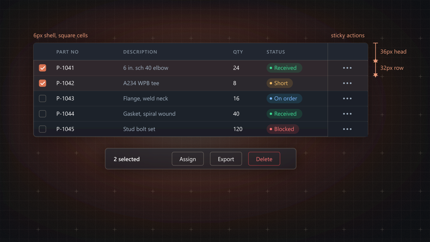
Quick usage
Import the shared component; never copy its markup into a feature. The Web TSX tab beside the live stage has a complete, working example.
import DataGrid from '@/shared/components/DataGrid';Live stage and code
The live component and its controls on the left, the code on the right; change a control and the code follows: Web TSX (the component in a working example), Tailwind and HTML (the markup it renders, with its data attributes), React Native, SwiftUI and Jetpack Compose. The header theme switch drives every stage.
Props
Read from the component's source when the docs build: names and defaults from its signature, types and descriptions from its JSDoc. A blank type means the prop has no JSDoc yet.
| Prop | Type | Default | Description |
|---|---|---|---|
columns | Column[] | - | `data` sets the cell in the data face. |
rows | object[] | - | - |
getRowId | (row) => string | - | - |
rowActions | (row) => React.ReactNode | - | - |
label | string | - | Accessible name (caption) of the table. |
Source: frontend/src/shared/components/DataGrid/DataGrid.js
DOM contract
What the rendered element carries: the data attributes its styles key on, its roles and ARIA, its focus style, and whether its stylesheet draws the 44px hit boundary. Also read from the source.
| Data attributes | data-aligndata-dsdata-figure |
| Roles | Native element semantics only |
| ARIA | None set by the component |
| Focus | No :focus-visible rule of its own |
| 44px hit boundary | Not a pressable root |
Accessibility and touch
Rows are 44px; row actions are 28px with the 44px target.
Visible height 28px. The ::after boundary adds 8px above and below, so a gloved finger lands on a 44px target while the row keeps its density.
Do and avoid
Rules and constraints
Use it for
- Lists of jobs, parts, POs: anything read down a column.
Avoid
- Never row actions that cover a cell at rest; reveal them on hover in a rail.
Constraints
- Shell --radius-surface, cells square, row dividers --border-subtle.
- Column heads are the only 10px text in the app (uppercase, --tracking-dense).
- Cell text 12px; figures in the tabular data face.