Light theme architecture
Light mode is not the dark ladder flipped. It is a four-rung surface stack that keeps its direction, with a two-rung state pair that turns around.
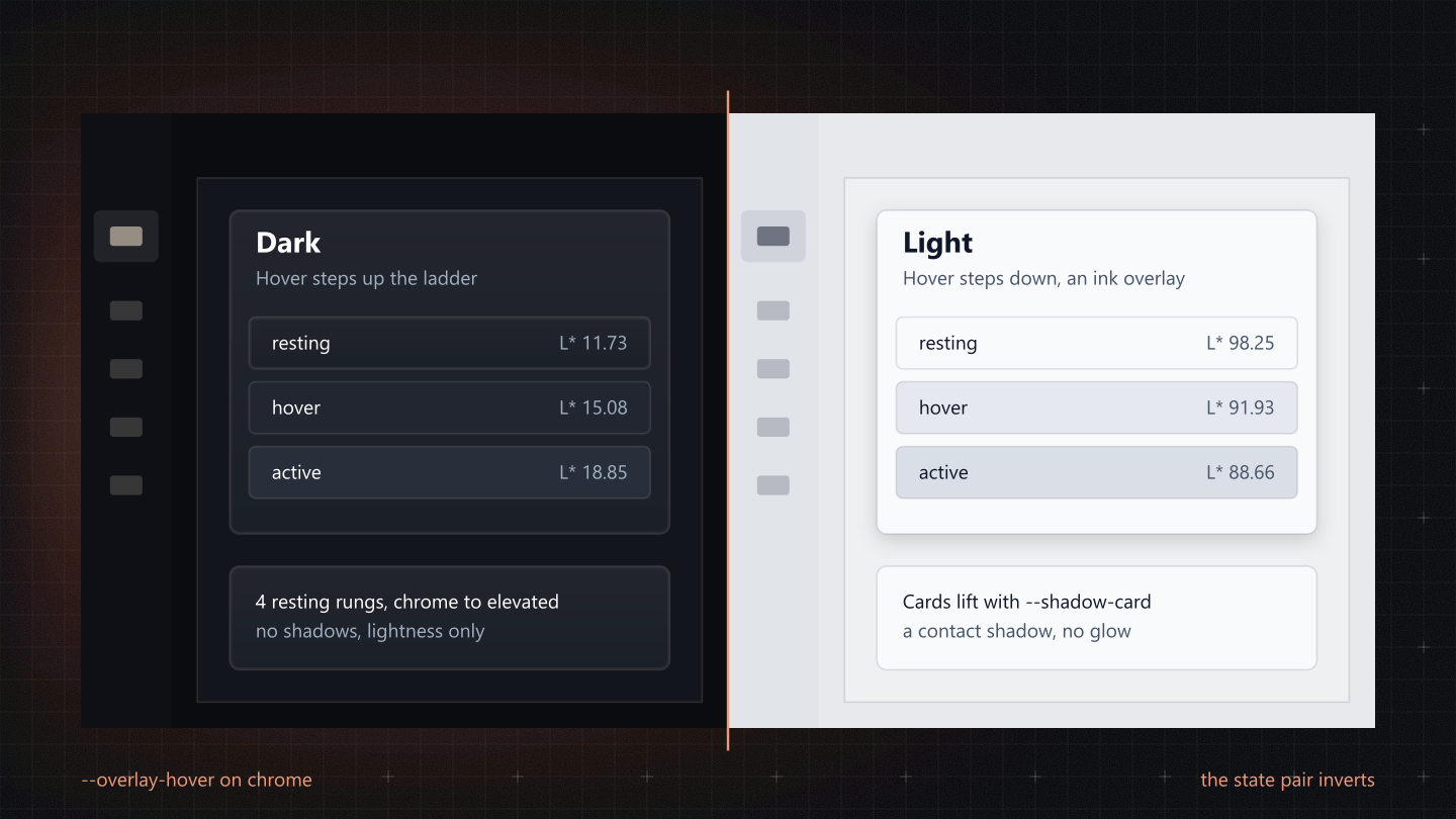
Not an inverted ladder
Read the obvious way, 'inverted' means L* light = 100 minus L* dark. That puts the app shell near white and cards in grey: white chrome framing grey cards, a hole where the panel should be. What actually inverts is the direction of STATE, not the order of the stack.
| Token | Light | L* | Dark | L* | Use |
|---|---|---|---|---|---|
--bg-chrome | #E7E9ED | 92.30 | #0A0C10 | 3.30 | App shell, global header |
--bg-chrome-2 | #E1E4E9 | 90.50 | #0E1016 | 4.71 | Sidebar tier 2, docked trays |
--bg-surface | #EFF0F2 | 94.77 | #12151C | 6.76 | Page canvas |
--bg-elevated | #F9FAFC | 98.25 | #1F242D | 14.07 | Cards, drawers, modals |
--bg-hover | #E5E8EE | 91.93 | #252B35 | 17.36 | Hover (a state) |
--bg-active | #DADFE7 | 88.66 | #2D333F | 21.15 | Pressed, selected (a state) |
- The stack keeps its dark-mode order: chrome-2 < chrome < surface < elevated, in both modes. Cards sit above the canvas, the canvas above the frame.
- State turns around. In dark mode hover and active step up; in light mode they step down, below the surfaces they act on. That is why they break the ascending read, and why they are right.
- Say it this way in a spec: a four-rung surface stack with a two-rung state pair that inverts direction between modes.
The chrome hover fix
The light hover rung is tuned to step down from content. The chrome rungs already sit below content, so on chrome-2 the absolute hover gets LIGHTER, the exact inversion the system forbids, on the most-hovered surface in the product.
| Resting surface | L* | To --bg-hover | To --overlay-hover |
|---|---|---|---|
--bg-elevated | 98.25 | -6.32 | -3.10 |
--bg-surface | 94.77 | -2.84 | -3.13 |
--bg-chrome | 92.30 | -0.37 | -2.89 |
--bg-chrome-2 | 90.50 | +1.43 (gets lighter) | -2.83 |
The fix adds no rungs. In light mode --overlay-hover is ink at 4% (and --overlay-active ink at 8%), a consistent step down on every surface, chrome included. The rule: a component resting on a chrome tier hovers with var(--overlay-hover), never var(--bg-hover). The absolute rungs stay correct on surface and elevated. It is a review rule, not a gate: whether an element rests on chrome needs the DOM, not the stylesheet.
Contrast math
Every text token against every rung in light mode. 12px is the floor size for labels, hints and counts, so 4.5 : 1 is the bar, not 3 : 1. The tightest pair is muted text in a selected row.
| Text | chrome | chrome-2 | surface | elevated | hover | active |
|---|---|---|---|---|---|---|
--text-primary | 14.69 | 14.01 | 15.66 | 17.09 | 14.54 | 13.34 |
--text-secondary | 6.23 | 5.95 | 6.65 | 7.26 | 6.17 | 5.66 |
--text-muted | 5.02 | 4.79 | 5.36 | 5.85 | 4.98 | 4.56 |
--text-sand | 5.07 | 4.84 | 5.41 | 5.91 | 5.03 | 4.61 |
--text-muted is #586371, not the obvious Slate 500 (#64748B), which measures 3.73 : 1 on chrome-2 and 3.56 : 1 on active and fails AA on four of the six rungs. Sand is a dark-mode warm light, so light mode re-binds it to a warm dark.
The danger ladder
A filled danger button puts a white label on its fill. White on --error is under 4.5 : 1, so the whole ladder moved as a unit to darker fills. Rebinding only the rest state would have left hover worse than before and made rest and pressed the same colour.
| State | Was | White label | Now | White label |
|---|---|---|---|---|
| Rest | --error | 3.91 | --error-active | 5.19 |
| Hover | --error-hover | 3.29 | --error-fill-hover | 4.61 |
| Pressed | --error-active | 5.19 | --error-fill-active | 6.87 |
Hover still lifts, as --primary does. The --error family itself is unchanged: it is right for validation text, icons and borders, none of which put white on a fill.
Dark and light, side by side
The same production card, the real ContentCard, rendered by the portal in each mode.