Color (Ferrum design system)
Color in Jeevy OS is an operational instrument, not a decorative palette. It sets the physical hierarchy of a screen, holds the eye where the work is, and reports the true state of the steel and the money.
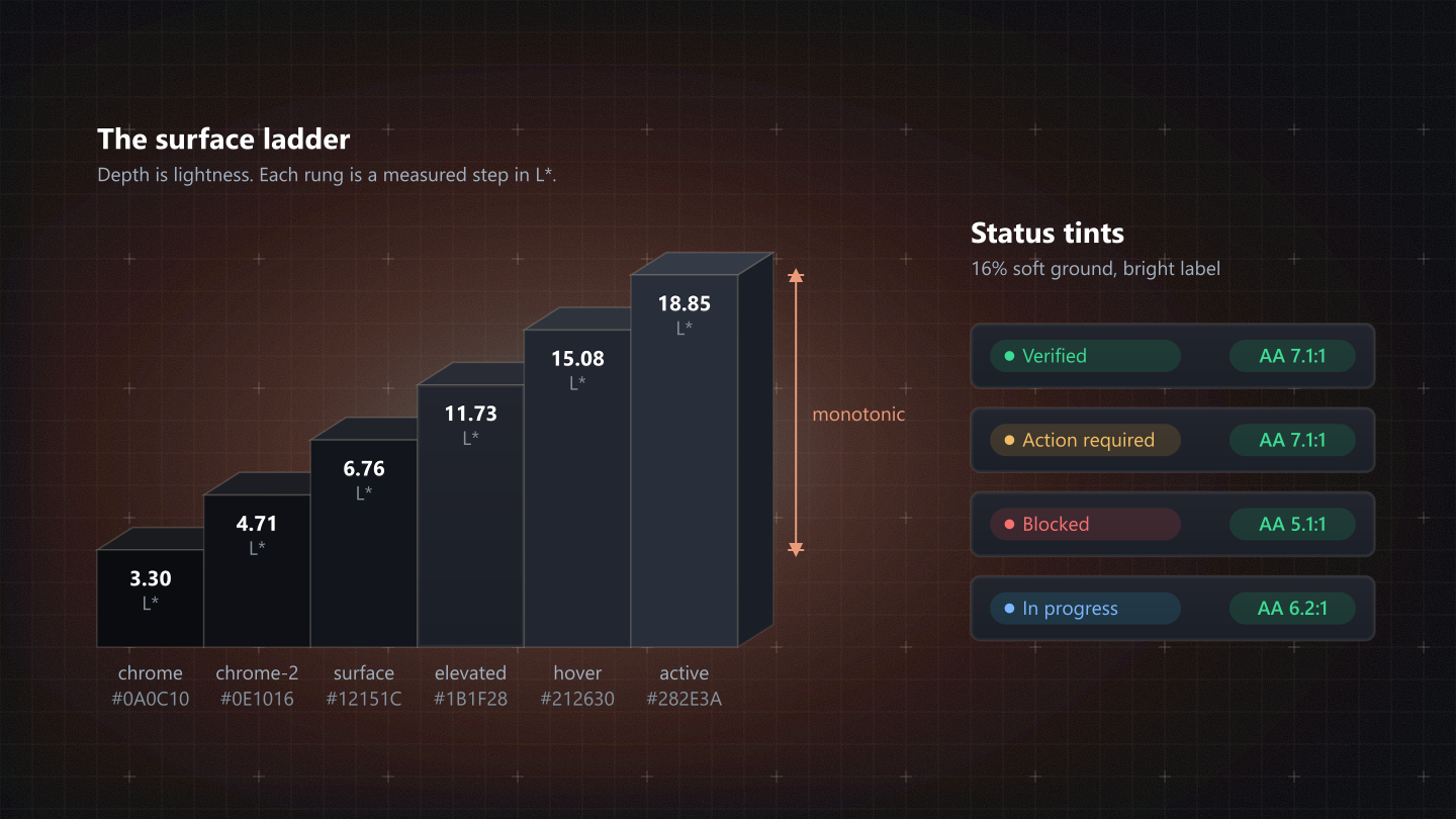
Our software competes with welding arcs, dust, grease on a capacitive screen and the glare of high-bay lighting. Under those conditions color cannot be ornament. In Ferrum it does three jobs: it builds depth, it steadies attention, and it tells the truth about a condition with no room for doubt.
Best practices
Use color as the exception, not the backdrop
Most of the interface is built from the neutral charcoal ladder and sand. Terracotta, green, amber and red are kept for the moments that matter: a state change, the one commit, an exception. A screen that spends color everywhere has nothing left to point with.
Never use color on its own
Every status pairs its color with a shape and a word: a green dot and Verified, an amber triangle and Action required, a red cross and Out of tolerance. A color-blind operator, or an estimator on a washed-out monitor, should never have to guess.
Hues name conditions, never actions
Success, warning and error say what condition a thing is in: the steel, the weld, the contract. They are never the fill of an ordinary button, because a green Save makes every real green on the floor mean a little less.
Design for glare
Overhead discharge lighting and greasy screens wash out anything subtle. Body text clears 4.5 : 1 with room to spare, so it reads from three feet away on a shop tablet; nothing important is grey on grey.
The monotonic surface ladder
Depth is lightness, not shadow. On a shop screen a soft drop shadow vanishes into the reflection, so Ferrum builds depth from a ladder of lightness (L*): four resting surfaces and two interactive states, each a measured step from the last.
--bg-elevated #1F242D, L* 14.07, +7.31 from the rung before. Work cards, data grids, modals and inspection drawers.
| Rung | Token | Dark | Light | What it holds |
|---|---|---|---|---|
| Chrome, tier 1 | --bg-chrome | #0A0C10, L* 3.30 | #E7E9ED, L* 92.30 | The 52px app rail and the frame around the whole viewport. |
| Chrome, tier 2 | --bg-chrome-2 | #0E1016, L* 4.71 | #F1F3F5, L* 95.75 | Secondary sidebars, docked trays and filter rails. |
| Canvas | --bg-surface | #12151C, L* 6.76 | #F7F8FA, L* 97.56 | The page itself: the scrolling workspace and the data canvas. |
| Card and panel | --bg-elevated | #1F242D, L* 14.07 | #FFFFFF, L* 100.00 | Work cards, data grids, modals and inspection drawers. |
| Hover | --bg-hover | #252B35, L* 17.36 | #E5E8EE, L* 91.93 | The stepped highlight on a row or tile under the pointer. |
| Active | --bg-active | #2D333F, L* 21.15 | #DADFE7, L* 88.66 | Pressed, selected or engaged. |
The hover invariant
In dark mode a surface steps up as it is hovered and pressed: lighter, towards the eye, against the dark canvas. In light mode it steps down, pressing in like ink into paper. An elevated card at L* 14.07 hovers to 17.36 in dark, and from 100.00 down to 91.93 in light. Switch the terrace above to see the two directions. Change all six rungs together or none: moving two of them is how a canvas ends up darker than its own sidebar.
Inclusive color and accessibility
Every text token is measured on both the canvas and the card, in both themes. The figures below are the lowest of those four grounds.
Primary text never falls below 15.6 : 1, which is what keeps a value readable through a face shield and a greasy screen protector. Muted text, the quietest thing we set, still clears 5.6 : 1, above the 4.5 : 1 AA floor. Every tier is measured, in both themes, in the specifications below.
Boundaries
WCAG asks 3 : 1 of the edge that identifies a control. Our structural edges are quieter than that on purpose, so a dense table is not a cage of lines, which means an edge must never be the only thing that marks a control: a field also has its label, its 32px height and its focus underline; a button its fill or its text.
Architectural atmospheres
Ferrum's answer to a spinner is warmth. A nesting run, a generated BOM or a purchase-order reconciliation can take several seconds, and a frozen screen makes a shop owner wonder whether the terminal has locked up.
Thermal diffuse
--gradient-thermal-diffuse washes warm sand at 18% through terracotta at 28% into the deep ground, softened by a 40px ambient blur. It breathes behind empty states and loading panels: the system is working, and nothing is wrong.
Chakra orbit
--gradient-chakra-orbit runs sand to terracotta to the deep primary, and turns once every twelve seconds while a model is reasoning: alive, but too slow to tire the eye on a long shift. See it on the AI atmosphere page.
Accents and state logic
Terracotta is forging heat, and it carries the most weight on the screen, so it is rationed.
The terracotta limit
Filled terracotta never covers more than 8% of the visible screen, and there is exactly one filled primary button per screen or open drawer: the commit, such as Commit work order or Save changes. Every other action is an outline or a ghost.
Condition hues, not action triggers
Green reports material received, a weld inspected, a test passed. Amber reports a breached material floor, exhausted float, a load held at the railhead. Red reports a part out of tolerance, a tripped safety gate, a hard-blocked critical path. None of them ever fills a routine control.
Platform considerations
Desktop and command centers
Dense tables, schedules and ledgers. Color steps back so the figures lead: quiet --border-subtle dividers between rows, and one rung of hover to show where the pointer is.
Shop-floor kiosks and wall monitors
Mounted on a bay column or built into a cutting table, read through gloves and dust. Status becomes larger, plainer tags, and every control carries at least a 44px hit area so a gloved thumb lands it first time.
Specifications and token mappings
All 117 colour tokens, light beside dark, with the contrast each earns where it is actually read. Values come from the token build, which reads the dark theme from the token file and the light theme from the portal's tokens.css; every ratio is computed.